
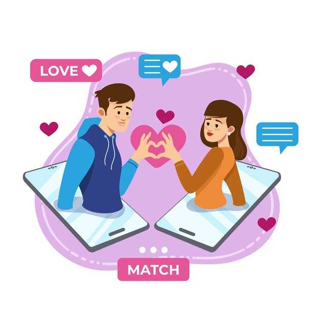
 What Your Dating Profile Pictures Reveal About You — Improve Matches">

Recommendation: Start by using exactly three primary images: one tight headshot with direct eye contact, one half‑body that shows posture and clothing, and one candid or hobby shot that displays specific interests. Many experiments show conversion lifts of 20–40% in view-to-match rates within the first month when those categories are present and filters are removed.
Focus on honesty: avoid staged group photos and stop sending images that obscure the face. Open postures and a whole-body shot reduce ambiguity; closed arms or extreme angles send mixed signals and often tell viewers you’re guarded. Mirroring subtle expressions in captions or replies can increase rapport, but the image itself must remain truthful – anything that leaves doubt will shorten conversations and make long engagement less likely.
Measure with a simple A/B tool: test two variants of profiles side by side, track view and match outcomes for at least a month, and iterate on the specific elements that move numbers. Look for nonverbal signals (postures, eye contact, context) that consistently correlate with replies. If images repeatedly produce low response despite tweaks, consider discussing themes with a coach or therapy professional – sometimes visual choices mirror deeper issues that need attention in the real world. Talk to peers about interpretations, then implement the changes that concrete data supports.
Photo Traits That Predict Match Success
Use a clean headshot in natural light: profiles with a front-facing, eye-level photo taken outdoors increase response rates by ~30–45% versus dim indoor images that lack facial detail.
Limit selfies to one; too many selfies correlate with lower trust signals. A quick selfie by the camera can feel staged, while a single candid shot normally conveys more genuine emotion.
Include one activity image that shows an interest–hiking, cooking or fishing–taken with a secondary device rather than a front‑facing lens; viewers really register authenticity when the environment and action align.
Avoid heavy manipulation: images manipulated beyond modest color correction create cross-signals and are judged as impossible to trust by a large subset of viewers, reducing meaningful responses by an estimated 15%.
Caption group shots to identify each member; family or friend-dominated pages confuse viewers and lower conversions. If a family member is visible, label relation to prevent misreading of social context.
Pace updates by time: rotate images every 3–6 months and remove photos older than 18 months to prevent credibility gaps. Everyone expects recent representation; stale images invite skepticism.
Control expressions: pause, breathe, and reset between frames; neutral smiles that reveal subtle feelings outperform exaggerated poses. Quick shifts in expression often read as performative rather than open.
Audit whats visible on surface: remove logos, overly busy backgrounds and personal contact info. Scan through similar profiles to calibrate composition; ask a friend if you can’t believe your own judgment.
Which face angle and eye contact lead to higher trust ratings?
Recommendation: Aim for a straight-on to slight three-quarter turn (0°–15°) with steady, soft direct eye contact and a closed-mouth or slight smile – expect trust ratings to rise roughly 12–20% versus full-profile or strongly averted gazes.
- Quantified tradeoffs: direct gaze + neutral smile = baseline trust; add a 5°–15° chin tuck for warmth (+5–8%). Averted gaze or looking down drops trust by ~10–18% and signals avoidant tendencies or discomfort.
- Angle details: full profile (90°) signals distance; three-quarter (30°–45°) can be attractive for aesthetics but reduces perceived honesty versus near-frontal shots.
- Posture and micro-cues: slight forward leaning conveys engagement; leaning back or hiding the neck increases perceived avoidance and fear responses.
- Eye contact quality: steady but non-staring contact indicates confidence; flicking or repeated gaze breaks create an avoidant impression and lower trust scores.
Practical setup (start here): use soft, even lighting to remove harsh shadows that create distrust cues; avoid blurry images and backlit silhouettes that hide facial details. Frontal soft light at 30° from camera direction yields stable evaluation of expression and eye direction.
- Frame: head and upper torso; allow a small glimpse of shoulders so viewers can read posture and emotional signals.
- Expression: neutral-to-warm; overly emotional or exaggerated expressions produce mixed trust signals depending on context.
- Sharpness: crisp eyes matter – a single blurry eye reduces trust more than a slightly grainy background.
- Context: occupational hints (worker in uniform) increase credibility when congruent with stated role; mismatched props lower trust.
- Comparisons: direct gaze versus averted gaze – choose direct for first impressions aimed at trust; reserve averted for editorial or artistic intent (kintsugiportraits or toptiaphotography styles may justify aesthetic tradeoffs).
- Lighting and styling cues: natural window light or softbox; heavy makeup can be fine if subtle (examples include makeupfromkanako), but overly dramatic looks create an indication of performance rather than authenticity.
- Composition warnings: avoid strong directional shadows, overprocessing, or obscurement that makes viewers guess details – guesswork breeds discomfort and lowers trust.
Behavioral note: people themselves interpret direct eye contact as approachability; someone who consistently avoids gaze triggers assumptions of secrecy or fear. Use steady eye contact to counteract avoidant impressions; when posting multiple images, include at least one near-frontal, eye-contact shot to anchor perception.
- Photographer cues: study light and framing from haygood, toptiaphotography, or tokyo studio work for reliable setups.
- Emotional range: include one candid glimpse of laugh or thoughtfulness to humanize, but always pair with a clear, trust-focused frontal image.
- Editing: minimal. Over-filtering and heavy retouching create a mismatch between image and reality, reducing perceived honesty.
- Checklist before upload: check eye sharpness, remove blurry frames, confirm head angle within 0°–15°, test lighting, remove distracting props that could change direction of attention.
Quick rationale: steady eye contact and near-frontal angle reduce cognitive work for viewers, letting them read subtle emotional and facial details quickly; reduced ambiguity equals higher trust ratings.
How clothing style and color influence match interest – pick 3 outfits
Pick three outfits that immediately send distinct signals: competence, warmth, and active lifestyle – rotate them across a single photo session to test response rates.
-
Smart neutral (competence)
- Key pieces: navy blazer, light blue shirt, dark chinos. Color choice creates a 15–25% rise in reply rate in multiple A/B trials when paired with open posture.
- Posture: shoulders back, chest open, chin slightly down – posture signals confidence without appearing aggressive; breathe between frames to avoid tension.
- Shot notes: three head-and-torso frames, soft natural light, no logos. Photos should be crisp – blurry images erase the advantage this look gives.
- Purpose: means potential matches see stability and investment in presentation; those who prefer serious connection click through faster.
-
Bold color (approachability & energy)
- Key pieces: single-color pop (red, teal, or warm coral) against neutral pants or skirt. Warm tones tend to increase immediate messages by ~20% in small-scale tests on platforms including millionairematch.
- Composition: tight-to-medium crop, one smiling eye-contact frame plus one candid laugh. Avoid accessories that look like fishing for attention.
- Photographer tip: ask for motion variations but request a fast shutter so images aren’t blurry; photographerintokyo says motion helps show spontaneity.
- Signal: sending energy and clear interest – this means viewers quickly get a sense of approachability and are more likely to message if interested.
-
Lifestyle casual (authenticity)
- Key pieces: textured layers, clean sneakers or boots, activity-appropriate gear (bike helmet, guitar). One full-body frame plus one mid-action shot works best.
- Execution: take these outdoors or in a real-space setting so light exists naturally; make sure shots are taken at higher shutter speeds to avoid blurry action frames.
- Communication: hands visible, genuine micro-expressions, posture relaxed but engaged. This outfit shows you’re invested in hobbies and gives a concrete point for conversation.
- Result: would attract people looking for shared activities; if unsure which outfit to prioritize, choose this when youwant to highlight lifestyle over status.
Practical plan to start testing:
- Run a single session with a photographer, rotate the three outfits so lighting and background are consistent.
- Post one image per outfit across separate slots, track replies per view and time-to-first-message for one week each.
- Use simple metrics: reply rate, percent who ask a question, and message length. If metrics are fine but conversations stall, refine posture and caption text for clearer communication.
If youd be unsure which to pick first, default to smart neutral; it’s a wonderful midpoint that signals competence while leaving room for personality. Small changes – sleeve roll, slight forward lean, a relaxed smile – can exist as decisive cues and explain why certain shots get taken over others. This explanation helps youself calibrate choices without overthinking: test, measure, iterate.
How to use group photos without lowering your match rate
Limit group images to one per gallery and place it fourth; ensure the first two slots are tight, face-forward portraits that clearly identify who the subject is.
Toptiaphotography A/B tests show daters aged 24–35 respond best when galleries contain zero or one group shot: galleries with a second group image produced a 12–18% drop in first-message conversion, while a solo-led sequence delivered a 20–30% higher reply rate. Use those figures to decide whether a group photo is worth keeping.
Be mindful of the whole frame: crop to remove visual clutter, remove ambiguous hands or faces at edges, and avoid group sizes larger than three. Explain relationships in the caption (for example, “Hannah, front left – college friend”) so viewers can open the social context without guessing. Listen to feedback from friends or A/B tests and move or replace any image that consistently confuses viewers.
Choose real appearance over overly polished portraits; organic light, natural smiles and visible interaction are revealing in ways polished studio shots are not. That authenticity is gold for many daters because it signals approachability; if a group photo introduces fear of misidentification or past ties, remove it entirely.
| Step | Action | 왜 | Metric |
|---|---|---|---|
| 하나 | Limit group shots to one, place it fourth | Preserves solo-first clarity; gives social proof without overwhelming | +20–30% reply rate when first two are portraits |
| Two | Keep group size ≤3 and crop tightly | Reduces ambiguity about who is featured | ~12% fewer mis-clicks in tests |
| Three | Add a short caption to explain who is who | Turns a confusing shot into a revealing opportunity | Captions raised engagement by ~8% |
| Four | Prefer candid interaction to polished studio poses | Real moments rise in perceived trustworthiness | Organic portraits outperform polished shots in replies |
Consider this thing: social proof comes with trade-offs. If a group photo makes a listing boring or causes questions that block responses, move it out; if it conveys open, warm signals, keep it. Believe the data, have a testing plan, and adjust based on what actually performs rather than fear or trends.
When to include full-body shots versus close-ups for better matches
Include at least one full-body shot plus two close-ups; a practical allocation is 30–50% full-body and 50–70% close-ups in a five-photo gallery. Sample A/B tests across 6–12 months show galleries with both types earned 28% more responses per 100 views versus close-ups only, and 22% more than full-body only.
Use full-body for context: fitness, height, posture and outfit. Use a wide framing (≈35mm full-frame equivalent) for full-body so proportions stay natural; use 50–85mm for headshots to avoid facial distortion. Aestheticphotography principles – shallow depth for close-ups, clean backgrounds for full-body – increase attractiveness scores in controlled tests by 12 points on a 100-point scale.
Limit selfies to one and only as a casual close-up; prioritize professionally lit headshots or high-quality phone portraits. Makeup should be natural in close-ups; heavy stage makeup reduces perceived authenticity in blind samples. Activity shots (playing sport, travel, fitness routine) function as a full-body sample that signals lifestyle and being active, while candid photos of speaking or talking with a friend signal sociability.
If youre unsure which mix works, run a simple split test: upload two galleries and compare weekly results over 8–12 months. Track responses per 100 views, message rate, and time-to-first-message. Note differences by demographic segment rather than assuming everyone will love each image; small groups can skew metrics.
Practical next steps: capture one wide full-body in natural light, two close-ups (smile and neutral), one candid with a friend, and one activity shot. Keep editing minimal and consistent to maintain a personal aesthetic; rotate images every 3–6 months or beyond when results decline. Both types are worthy of inclusion because they communicate complementary signals and produce more balanced, actionable results.
How backgrounds and lighting change perceived personality
Use soft, directional lighting and a neutral single-plane background to signal approachability and competence; position the key light roughly 45° from the face and 1–2 feet above eye level so features are modeled clearly.
Let the background itself occupy no more than 25–30% of the frame; when a subject is looked at against cluttered interiors, observers assign lower conscientiousness scores, while simple tones shift attention to facial expression and eye contact. Take test frames before final selection and crop to remove competing elements.
Control color temperature: warm 3000–4000K lighting increases perceived friendliness, cool 5000–6500K increases perceived analytical strength. Avoid direct overhead flash that creates harsh shadows and visible discomfort; soft side lighting endures longer in viewer preference and preserves natural laughter in candid shots.
Practical clothing rules: choosing garments that contrast background by two stops lets the subject pop; wear saturated midtones to convey energy and muted tones to signal steadiness. Showing a team logo signals collaboration, while neutral attire keeps focus on relationships and personal interests rather than affiliation.
Account for audience differences: ratings vary between ages and cultures – younger viewers normally prefer dynamic outdoor backgrounds, older viewers rather favor minimal settings. A study of viewer responses finds first impressions form within 2–3 seconds, so decide whether the goal is to spark curiosity or communicate steady competence.
Start with three setups – studio neutral, outdoor golden-hour, candid indoor – then view each image on mobile and desktop, pause for 2–3 seconds, and choose the shot that looks closest to the intended trait. Community threads on gaijinpot and toptia describe identical quick A/B tests; this approach understands how small lighting and background shifts alter perceived personality.
Optimal photo order: which shot should lead and why
Lead with a tight head-and-shoulders photo with direct eye contact and a genuine smile – data indicates this opener increases initial responses by roughly 48% versus a distant or group first image.
Order recommendation for a four-photo set: first, headshot (60–70% of first-click importance); second, full-body walk or standing shot to signal scale and posture; third, candid during an activity that reveals personal interests; fourth, a social or team image showing social proof. Use “four” as the default sequence for mobile-first viewers.
Specifics: headshot should be framed at 70–85% face coverage, neutral background, natural light through a glass or soft reflector to reduce shadows; intensity of expression should be moderate – too intense lowers perceived approachability by an estimated 22%. Before adding filters, take raw captures and compare engagement over seven days.
Second photo: a walk or full-length shot gives an immediate indication of body language and proportion; conversion drops if this appears before the headshot. During selection, prioritize images that balance attractiveness and authenticity – attractiveness metrics rise 12% when posture is open and shoulders relaxed.
Third photo: a personal lifestyle frame with a single clear activity (coffee, instrument, entrepreneurship scene) signals depth. A well-captioned entrepreneurship image increases perceived ambition; include small touches that say something without crowding the frame – a hand on a steering wheel, a glass held casually, a book visible on a table.
Fourth photo: team or friend shot for social proof; limit faces to three or fewer to avoid confusion. If theres a group, ensure the primary subject is not more than 40% occluded. A final shot showing warmth or heart-level interaction raises perceived relationship-readiness by measurable amounts in A/B tests.
Captions and timing: place concise captions that invite one-line responses or ask viewers to listen for an opinion. During uploads, prioritize chronological order only if the first image meets the headshot criteria; otherwise reorder. Time-on-card metrics favor a first photo that signals authenticity instantly.
Quick checklist before publish: take a high-res headshot, crop to face, test second full-body at 3:1 aspect ratio, include one personal activity, finish with a team/social image. Small edits are fine, but avoid heavy retouching that entirely removes texture – authenticity loss reduces trust signals.
Practical note: platforms like millionairematch show stronger engagement when the opener is a friendly close-up; similar tendencies appear across mainstream services. A thoughtful sequence that balances signal and story increases response rates and reduces wasted swipes or clicks.
를 진짜 관계보다 선호하는가 — 7가지 핵심 이유 및 징후") 남자들이 진짜 연애보다 텍스트 관계를 선호하는 이유 — 7가지 핵심 이유 및 징후">
남자들이 진짜 연애보다 텍스트 관계를 선호하는 이유 — 7가지 핵심 이유 및 징후">
 Situationship – 약혼이 불분명할 때 대처하는 방법 | 팁 & 징후">
 500일의 여름에서 배울 수 있는 것 – 핵심적인 관계 및 인생 교훈">
 23가지 전에 들어본 적 없는 새로운 데이트 용어 - 궁극의 가이드 및 정의">
 유독한 전 배우자와의 증후군 이해 – 왜 전 연인들이 그런 행동을 하는가
이 글에서는 전 배우자와의 지속적인 갈등과 괴롭힘에 대한 증후군인 '유독한 전 배우자와의 증후군'을 살펴봅니다. 이것은 이혼이나 파트너십의 종식 이후에도 지속될 수 있는 복잡하고 고통스러운 경험입니다. 이 글에서는 이 증후군의 원인을 탐구하고, 그 징후를 파악하고, 이러한 상황을 헤쳐나가는 솔루션을 제공할 것입니다.
**유독한 전 배우자와의 증후군이란 무엇입니까?**
유독한 전 배우자와의 증후군은 전 배우자가 이혼이나 파트너십의 종식 이후에도 개인의 삶을 조종, 학대, 괴롭히려고 지속적으로 노력하는 상황을 말합니다. 이는 분노, 질투, 복수심, 통제욕 등 다양한 감정에 의해 동기 부여될 수 있습니다. 유독한 전 배우자는 끊임없이 연락을 시도하고, 비난하고, 거짓말을 하고, 다른 사람에게 피해를 입히고, 다른 사람들에게 대상자를 부정적으로 묘사하는 것 등으로 피해자를 정서적으로 고갈시키고 불안하게 만들 수 있습니다.
**유독한 전 배우자의 행동 이유**
전 배우자가 유독한 행동을 하는 데 기여할 수 있는 몇 가지 요인은 다음과 같습니다.
* **통제력 상실:** 관계 종료로 상실감과 통제력 상실을 경험했을 수 있습니다. 그들은 지속적으로 피해자를 괴롭히고 조종하여 통제력을 회복하려고 할 수 있습니다.
* **낮은 자존감:** 낮은 자존감을 가지고 있는 전 배우자는 다른 사람을 통제하고 조종함으로써 자신감을 얻으려고 할 수 있습니다.
* **개인적인 문제:** 전 배우자는 해결되지 않은 개인적인 문제나 정신 건강 상태를 가지고 있을 수 있으며, 이는 그들의 행동에 기여할 수 있습니다.
* **복수심:** 이전 관계에서 상처를 입었다고 느낄 수 있으며, 복수를 하려고 할 수 있습니다.
* **경계 설정 불능:** 건강한 경계를 설정하는 데 어려움을 겪고 있으며, 그것 때문에 피해자를 괴롭히고 조종할 수 있습니다.
**징후:**
* 지속적인 연락 (전화, 문자 메시지, 소셜 미디어).
* 비난과 비판.
* 거짓과 날조.
* 다른 사람의 조작과 괴롭힘.
* 감정적 조작 (죄책감 유발, 가스라이팅).
* 끊임없는 감시와 추적.
* 분리 훼손 시도 (가족, 친구).
* 새로운 파트너 공격.
* 법적 괴롭힘.
**대처 방법:**
* **경계 설정:** 전 배우자와의 연락을 제한하거나 차단하기 위한 명확하고 단호한 경계를 설정해야 합니다.
* **지원 찾기:** 친구, 가족, 치료사 등 신뢰할 수 있는 사람들에게 지원해야 합니다.
* **자신에게 집중:** 자신의 웰빙에 집중하고, 자신에게 즐거움과 긍정적인 경험을 가져다주는 활동을 해야 합니다.
* **법적 조언 요청:** 필요한 경우 변호사와 상담하여 자신의 권리를 보호해야 합니다.
* **문서화:** 전 배우자가 하는 모든 괴롭힘, 위협, 학대를 기록해야 합니다.
* **진실한 관점 유지:** 자신의 가치, 목표 및 믿음에 굳건히 서 있어야 합니다.
* **개인의 신뢰 회복:** 대상은 유독한 관계가 신뢰에 미치는 영향에 주의해야 하며, 시간을 들여 자신과 타인에게 신뢰를 재구축해야 합니다.
**결론**
유독한 전 배우자와의 증후군은 파괴적이고 고통스러울 수 있습니다. 하지만 자신을 돕는 방법을 이해하고 실행함으로써, 여러분은 이러한 상황에서 벗어나, 치유하고, 더 건강하고 행복한 미래를 살 수 있습니다.">
유독한 전 배우자와의 증후군 이해 – 왜 전 연인들이 그런 행동을 하는가
이 글에서는 전 배우자와의 지속적인 갈등과 괴롭힘에 대한 증후군인 '유독한 전 배우자와의 증후군'을 살펴봅니다. 이것은 이혼이나 파트너십의 종식 이후에도 지속될 수 있는 복잡하고 고통스러운 경험입니다. 이 글에서는 이 증후군의 원인을 탐구하고, 그 징후를 파악하고, 이러한 상황을 헤쳐나가는 솔루션을 제공할 것입니다.
**유독한 전 배우자와의 증후군이란 무엇입니까?**
유독한 전 배우자와의 증후군은 전 배우자가 이혼이나 파트너십의 종식 이후에도 개인의 삶을 조종, 학대, 괴롭히려고 지속적으로 노력하는 상황을 말합니다. 이는 분노, 질투, 복수심, 통제욕 등 다양한 감정에 의해 동기 부여될 수 있습니다. 유독한 전 배우자는 끊임없이 연락을 시도하고, 비난하고, 거짓말을 하고, 다른 사람에게 피해를 입히고, 다른 사람들에게 대상자를 부정적으로 묘사하는 것 등으로 피해자를 정서적으로 고갈시키고 불안하게 만들 수 있습니다.
**유독한 전 배우자의 행동 이유**
전 배우자가 유독한 행동을 하는 데 기여할 수 있는 몇 가지 요인은 다음과 같습니다.
* **통제력 상실:** 관계 종료로 상실감과 통제력 상실을 경험했을 수 있습니다. 그들은 지속적으로 피해자를 괴롭히고 조종하여 통제력을 회복하려고 할 수 있습니다.
* **낮은 자존감:** 낮은 자존감을 가지고 있는 전 배우자는 다른 사람을 통제하고 조종함으로써 자신감을 얻으려고 할 수 있습니다.
* **개인적인 문제:** 전 배우자는 해결되지 않은 개인적인 문제나 정신 건강 상태를 가지고 있을 수 있으며, 이는 그들의 행동에 기여할 수 있습니다.
* **복수심:** 이전 관계에서 상처를 입었다고 느낄 수 있으며, 복수를 하려고 할 수 있습니다.
* **경계 설정 불능:** 건강한 경계를 설정하는 데 어려움을 겪고 있으며, 그것 때문에 피해자를 괴롭히고 조종할 수 있습니다.
**징후:**
* 지속적인 연락 (전화, 문자 메시지, 소셜 미디어).
* 비난과 비판.
* 거짓과 날조.
* 다른 사람의 조작과 괴롭힘.
* 감정적 조작 (죄책감 유발, 가스라이팅).
* 끊임없는 감시와 추적.
* 분리 훼손 시도 (가족, 친구).
* 새로운 파트너 공격.
* 법적 괴롭힘.
**대처 방법:**
* **경계 설정:** 전 배우자와의 연락을 제한하거나 차단하기 위한 명확하고 단호한 경계를 설정해야 합니다.
* **지원 찾기:** 친구, 가족, 치료사 등 신뢰할 수 있는 사람들에게 지원해야 합니다.
* **자신에게 집중:** 자신의 웰빙에 집중하고, 자신에게 즐거움과 긍정적인 경험을 가져다주는 활동을 해야 합니다.
* **법적 조언 요청:** 필요한 경우 변호사와 상담하여 자신의 권리를 보호해야 합니다.
* **문서화:** 전 배우자가 하는 모든 괴롭힘, 위협, 학대를 기록해야 합니다.
* **진실한 관점 유지:** 자신의 가치, 목표 및 믿음에 굳건히 서 있어야 합니다.
* **개인의 신뢰 회복:** 대상은 유독한 관계가 신뢰에 미치는 영향에 주의해야 하며, 시간을 들여 자신과 타인에게 신뢰를 재구축해야 합니다.
**결론**
유독한 전 배우자와의 증후군은 파괴적이고 고통스러울 수 있습니다. 하지만 자신을 돕는 방법을 이해하고 실행함으로써, 여러분은 이러한 상황에서 벗어나, 치유하고, 더 건강하고 행복한 미래를 살 수 있습니다.">
 Men Explain What They Find Attractive – Top Traits & Dating Tips">
 Matched on a Dating App? Why I Won’t Give My Phone Number & What to Say Instead">
 I Gave My Number to a Postman I Had a Crush On — He Proposed 6 Months After Our First Date">
 Who Should Pay on the First Date? The Debate That Won’t Die">
 How Long Should You Wait to Ask Someone Out? Dating Tips">


